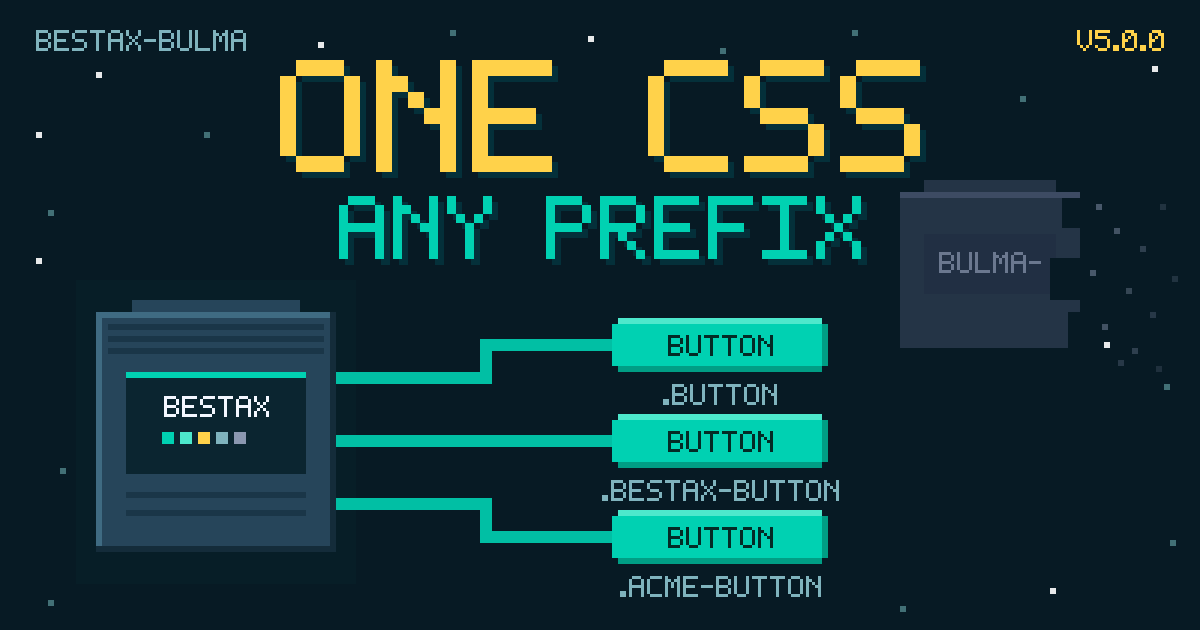
v5.0.0: One CSS, Any Prefix
In June, bestax-bulma v5.0.0 shipped exactly one breaking change, and it was a deletion: 3 files touched, 22 lines removed, 0 added. If you never imported versions/bestax-bulma-prefixed.css, you won't feel a thing.
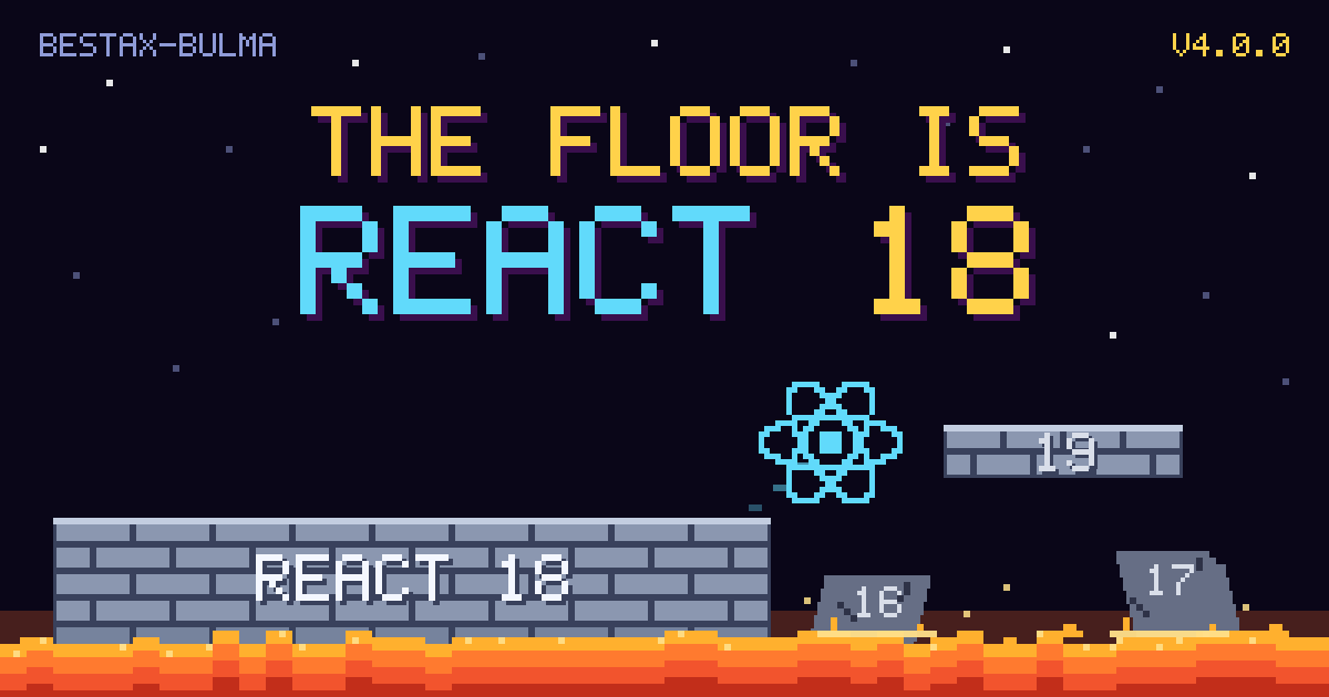

In June, bestax-bulma v4.0.0 dropped support for React 16 and 17. That's the whole release: one breaking change, no new components, and if you're on React 18 or 19 you won't feel a thing. Here's why I moved the floor anyway.
Round two. Since January's batch of extra components, four more Enhanced Add-Ons have landed: original components that go past what the Bulma spec covers while keeping Bulma's helper props, CSS variables, and theming. Meet Avatar (and its stacking sibling Avatars), Badge, Reveal, and LinkButton.
Back in January, our Extra Components post ended with a promise: DateInput, TimeInput, and Colorpicker were coming. In June, v3.0.0 delivered the date and time pickers (plus a DateTimeInput we never promised) inside a release that added about 30 new components in one shot. Two out of three ain't bad.
We're excited to announce a major addition to bestax-bulma: Extra Components. This release adds 15 new components that extend the core library with advanced UI controls and form inputs.
We're excited to announce version 2.0.0 of @allxsmith/bestax-bulma, bringing powerful new configuration and theming capabilities that fully embrace Bulma v1's modern approach to CSS customization.
This release introduces two major features that transform how you can customize and integrate Bulma components: ConfigProvider for global component configuration (including CSS class prefixing), and Theme for comprehensive CSS variable-based theming.

With ConfigProvider, you can now globally configure all bestax-bulma components using the useConfig hook, enabling seamless integration with other CSS frameworks through class prefixing. The new Theme component allows you to customize Bulma's appearance using CSS variables at both global and scoped nested levels, giving you unprecedented control over your design system.
We need to address an important note about versioning: we accidentally bumped this release to 2.0.0 instead of the intended 1.2.0. This became a major release due to a semantic-release configuration issue, when it should have been a minor release.
However, all changes are completely backward compatible - version 2.x.x is fully compatible with 1.x.x. We decided it's easier to move forward with the new version number rather than create confusion with republishing.
We completed the first full release, with a react component per each Bulma component.
The first release is published under @allxsmith/bestax-bulma.
The package name changed from bestax-lib to bestax-bulma to help users search and find the project.
We reset the package version number from 1.x and 2.x to 1.0.0 since this is the first true release under the new package name.